
The Creative Overlay Menu in Elementor — A Full-Screen Menu That Shows Off
Your client’s landing page is done. The layout’s crisp, the hero’s exactly what they asked for. Only the menu feels a little dead — they keep tapping it and waiting, and when the drop-down finally unfurls there’s that quiet little disappointment you recognise from across the desk.
Motion design was never my job. Except it just became my job, around 4pm, with the client watching, and I didn’t have a motion designer on speed dial. What I had was a widget that opens the whole screen, shows a headline and a CTA, and moves in the back. That widget is the Creative Overlay Menu in Reboot Addons, and it’s the one that keeps saving me.
There’s a widget for the “wait, what just happened” menu
You drop it into a section in Elementor, point it at a WordPress menu (you’ve got one already), and open the panel. On click it takes over the whole screen — a kicker line, a headline, a paragraph, a CTA, and your social row beneath it. Every one of those is a text field. I have never once written a line of CSS to make that happen, and neither do you.
Here’s the part that sold me. It’s not a menu, exactly. It’s a small full-screen landing panel that happens to carry navigation. That’s the difference between a doorway and a moment — and this is the moment one.

The motion is the star — and you pick from eleven
In the Style tab there’s a control called Surface Motion with eleven options. Abstract Waves, Flowing Nebula, Digital Rain, Refractive Shards, Liquid Morph — I keep coming back to the waves one. It reads like the surface of a pond after someone’s dropped a stone, and it moves slow, which is exactly the point.
The three controls that actually matter when you’re tuning it: Animation Speed, Effect Colour, Effect Opacity. I leave Animation Speed alone — it’s restrained by default and I usually agree. Effect Colour is your brand colour, so pull it from the site and move on. Effect Opacity is the one I touch. Turn it down until the surface sits quietly behind the nav and the copy does the talking, and stop. That’s the whole pass.
The short version: a full-screen overlay menu with a kicker, headline, description, CTA and social row, plus eleven animated Surface Motion options — all in a drag-and-drop Elementor widget. No custom JS. No custom CSS. Pick a motion, tune the colour, done.

The part that’s not a menu
Most fancy-menu tutorials stop at the animation. This one keeps going, and that’s the reason it reads as a designed page rather than a plugin. Under the nav there’s a whole second column: a kicker, a headline, a paragraph, and a button. Then a row of meta links — Instagram, Behance, LinkedIn, Contact by default, and you can add more.
So the overlay isn’t a doorway, it’s a small landing panel that happens to navigate. I use the kicker for a short label, the headline to say in plain words what the site is, and the CTA to push people to the next step. That’s the difference between “here’s the sitemap” and “here’s who we are, and here’s what to do next.”
What I leave alone
There’s plenty you could touch — panel width, radius, the backdrop colour, the trigger background, the hover states. I leave most of it. The trigger looks good enough out of the box and the close chip is fine. Two I almost always set: the trigger text (I want it to say “See the work” or “Start a project”, not the default) and the CTA link, which is wherever I actually want people to go.
It’s a Pro widget — the free tier already gives you an Advanced Menu if you need the simpler off-canvas job — but this is the full-screen, copy-carrying one. And it runs on free Elementor. Pro is optional. That’s a lot of the reason it’s in my stack.
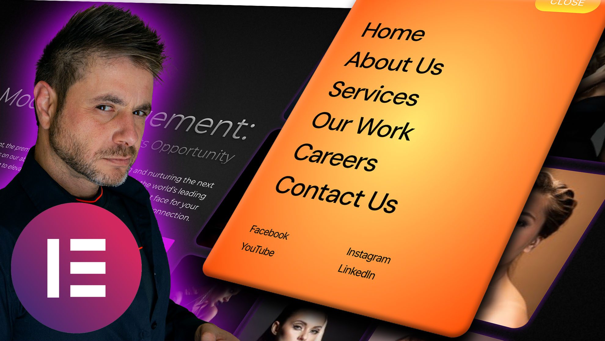
Creative Overlay Menu is a Pro widget, but the free tier already has the Advanced Menu for simpler off-canvas jobs — install the plugin, pick a widget, and the motion is there.
Frequently asked stuff
Do I need Elementor Pro for this?
No. Reboot Addons works on the free Elementor plugin — Pro is optional and can stay active. The Creative Overlay Menu itself is a Pro-tier widget; the free tier gives you the Advanced Menu for simpler navigation.
Have I written the custom code?
You could have. A lot of these menus live or die by hand-rolled animation work — the timelines, the easing curves, the lot. Here it’s already built and the animation library ships with the plugin. You pick from eleven Surface Motion options and tune a few controls. That’s the whole build.
What does it look like in the editor vs live?
Worth knowing before you judge it: in the editor it opens in place, scrolling inside the widget area. On the live site it opens as a full-screen overlay. So if it looks “small” in preview, don’t trust the preview — check the front end.
Can I put a CTA in a menu? That seems backwards.
It’s designed for it. The overlay ships with kicker, headline, description and CTA as first-class fields, plus your own meta links. It behaves like a full-screen panel that also navigates, which is exactly why it reads well on a portfolio or a launch page.
How do I keep the text readable over the motion?
Effect Opacity is the lever. Turn it down until the surface sits quietly behind your nav and the copy does the talking. Animation Speed and Effect Colour are the two smaller knobs. That’s the entire tuning pass — I’ve never needed a fourth.
You don’t owe every menu a dramatic entrance. Some pages want a clean drop-down and that’s the right call. The portfolio index, the agency home, the one page that’s actually your moment — those are where the overlay earns its keep. A few fields, a motion pick, and the site finally shows off the way the work does.
It’s one widget in the navigation family, alongside the App-Style Menu and the Image Reveal Menu — all in the Reboot Addons navigation row. And if the menu is the last 10% of the page and the rest of it needs the same no-custom-CSS treatment, the card widgets post picks up that thread.
R749 vs R999 vs R1999 — What Each Website Package Actually Gets You
The question comes up in the same shape every time. “So how do I know I’m not paying R1999 for a R749 site?” Fair. The number on the invoice is the part you can see – what’s actually different underneath is the part you can’t, and that’s the part worth spelling out before you pick one.
So here it is, the four monthly plans, side by side, with what I actually do on each one. No “enterprise-grade” filler. If a line below matters to you, that’s your number.
The four plans, what each one actually builds
R749/month — Business Website. A custom WordPress site on Elementor, unlimited pages and content updates, free domain, hosting and SSL, mobile-ready, a built-in SEO foundation, and ongoing support and maintenance. This is the default pick for the service business, the clinic, the law firm, the salon that needs it to look like it costs money. No deposit, no contract.
R999/month — Ecommerce (WooCommerce). Same base, plus a store built from scratch: unlimited products and images, stock control with low-stock alerts, and payment and courier wiring — PayFast, PayPal, and couriers like uAfrica, DHL, CourierIT. Free hosted-in-South-Africa hosting, SSL, unlimited mailboxes, and video walkthroughs for running the store. If you sell online, this is the one — the difference from the R749 is that the R999 has a checkout.

R1499/month — Platinum Business. Everything custom, which is the whole point. No stock templates, no generic blocks. Bespoke animations, headers, forms, backgrounds, custom front- and back-end functionality, full branding with your own fonts and colours. It’s for the business where the site is the pitch. Still no deposit, no contract.
R1999/month — Platinum Ecommerce. A fully custom WooCommerce build — bespoke buttons, forms, navbar and footer, advanced animations, custom code front and back, a blog wired for SEO, and secure payment integration. Hosting, SSL, support included, no upfront deposit, no lock-in. This is what the online stores with a real brand ask for.
The short version: R749 = custom business site, done. R999 = that plus a working store and payments. R1499 = every pixel bespoke. R1999 = a fully custom store. All four: hosted in SA, no deposit, no contract. You’re paying for scope, not for a number. See the full package breakdown for the exact inclusions on each one.
The part nobody writes down

Everyone assumes the gap between R749 and R1999 is about “features” — more plugins, more pages. It isn’t. It’s about how much was made for you versus put together for you. The R749 and R999 are the 90% of businesses. I build those every week and they look finished because they are. The Platinum tier is the 10% where the client had a specific idea that a template can’t reach, and I end up writing the code for it myself. Different labour, different price. That’s the honest split.
Frequently asked stuff
Is there really no deposit and no contract?
Yes on the four site plans. It’s monthly, you can stop it. The hosting runs in South Africa and comes with the plan — you’re not separately buying a server.
What’s the difference between the R749 and the R999?
One line: does it sell things? The R999 adds WooCommerce, stock alerts, and payment + courier integrations. If you don’t sell online, the R749 is the right size and you shouldn’t pay the R250 difference.
What do I actually get for free as part of a monthly plan?
Domain, hosting, SSL and unlimited content updates are bundled into the R749, R999, R1499 and R1999 plans. Support and maintenance roll into the same number — it’s not a separate line you pay later.
Not sure which tier fits? See all four packages with exact prices, or talk it through — the right call is usually the smaller one.
Prefer to talk it through first? Send the question over — a real person answers it.
Advanced Text FX in Elementor — 58 Text Effects in One Widget
It came through as a voice note, so I got the tone: the client wants the headline to “do something when the page loads.” Not a hover. Not a fade. Something. I’ve heard that word before every time I’ve built a hero, and every time it meant two weeks of someone copying a GSAP tutorial at 1am.
That’s the job this widget exists to kill. Advanced Text FX is one of the 15 Pro widgets in Reboot Addons, and it’s one Elementor widget with 58 text effects inside it. You pick the text, pick an effect, set the duration and the stagger. Done. The code that makes the letters move is already sitting in the plugin folder, and it loads only when the widget is on the page. And the part that matters most: it runs on free Elementor. “Pro” here means Reboot Addons Pro, not the other kind — none of it asks for Elementor Pro.
Fifteen core effects, forty-three that get weird
The core set starts the conversation. Fifteen effects, each with its own levers — Effect Type, Duration (ms), Start Delay (ms), Stagger (ms) — and a few are genuinely the ones people actually want. Scramble Decode, where the text untangles itself. Typewriter, which actually types. Glitch, with two colour channels and an overlay you can dial. Neon Flicker, where you set the glow colour and the flicker speed yourself.
Then the reveals: Blur Reveal, Zoom Blur In, Letter Flip In, Rise Bounce In, Mask Wipe, Slide Stagger, Word Stagger In. Each one has its own lever — Stagger (ms), Duration (ms), Start Delay (ms) — and a couple with a character to match: Bounce Overshoot (px) on the bounce, Prism Channel Offset (px) and Prism Skew (deg) on Prism Resolve, Echo Trail Distance (px) and Echo Trail Blur (px) on Echo Trail. It’s not one generic reveal with a colour picker on top.
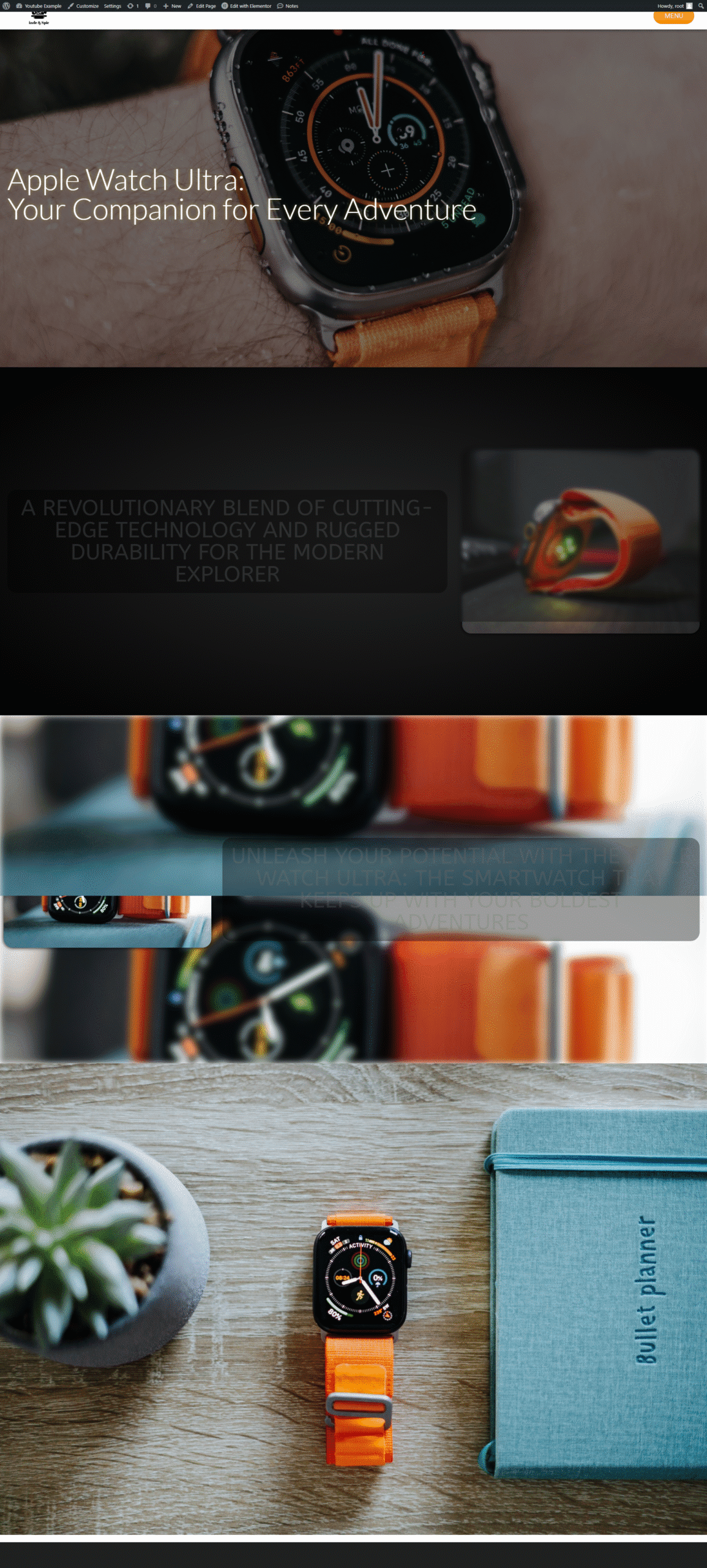
The premium layer is where it gets weird
The premium layer adds 43 more, and these are the ones I’d normally have to build as a weekend project: GSAP: Neon Sign, with its own Flicker Stagger (s). GSAP: Matrix Rain. GSAP: CRT Boot. GSAP: Origami Unfold, where you literally set Rotation Y (deg) and Stagger (s). GSAP: Scramble Decode, where the Scramble Characters are yours. GSAP: Redacted Reveal — the black bars sliding off a sentence. GSAP: Word Shuffle. GSAP: Slot Machine. Yes, slot machine. For a headline.
The short version: Advanced Text FX is one Pro widget in Reboot Addons, 58 effects inside it: 15 core (scramble, typewriter, glitch, neon flicker, and the reveals) plus a 43-effect GSAP premium layer (neon sign, matrix rain, CRT boot, origami unfold) — all set in the panel, all on free Elementor, no JS to hand-roll.
How it actually loads
Worth one honest paragraph, because “no bloat” gets used a lot. Each effect has its own file — I count 58 JS files under the plugin’s effects folder — and the widget registers each one as it’s used. The page you build with Typewriter doesn’t ship the Slot Machine code. That’s the model I like in a plugin: the effect is a file, the file loads with the widget, and nothing else loads in its absence. It fits right alongside the rest of the content-effects family in the panel, all in one place.
Frequently asked stuff
Is Advanced Text FX free?
Not on its own — Advanced Text FX is one of the 15 Pro widgets in Reboot Addons. What’s free in the plugin is the other seven content widgets and all six form stylers, and those are genuinely worth installing. And “Pro” here means Reboot Addons Pro: the widget runs on free Elementor, and nothing in it asks for Elementor Pro.
Does it need Elementor Pro?
No. It runs on the free Elementor editor. That’s the important bit, because everyone reaches for the “Pro” word here and assume it’s the other Pro. Reboot Addons Pro is a one-time licence; the editor it plugs into is the free one.
How is this different from a CSS animation I write myself?
It isn’t, under the hood. The difference is you don’t write it, host it, or debug why it stutters on a mid-range Android. You pick from 58, tweak Stagger and Duration, and move on to the next thing.
Why does the effect list mention GSAP at all?
Because the premium effects are built on it — the plugin bundles GSAP and loads it per effect. The core set runs on its own lightweight files, no GSAP. Either way, you never touch a timeline.

Advanced Text FX is a Reboot Addons Pro widget — 58 effects, no JS to write. The free version of the plugin is worth installing first: seven content widgets and all six form stylers. Want the lay of the land? Start here.
Elementor Card Widgets without Custom JS — The Free Tier
You’ve seen the card carousel that a client sent you a screenshot of and said “can we have that.” You’ve seen the card reveal that needs a GSAP timeline. You’ve seen the hover effect that needs a few hundred lines of vanilla JS with Intersection Observer and will-change and a compositor check.
All of those, in the Reboot Addons free tier, are Elementor widgets. You set values in the panel. You don’t write code. The JS is already shipped. That’s the whole thing.

What “no custom JS” actually means here
The free Reboot Addons ships seven content widgets — plus all six form stylers — that do work you’d otherwise hand-build. 3D Carousel. 3D Vertical Carousel. Card Slider. Content Fade Reveal. Business Hours. An advanced menu. A back button. The six Form Stylers. The widget CSS and JS are loaded by the widget. The moment the widget isn’t on the page, the JS isn’t running. Not loaded, not blocking, not on the compositor while invisible.
That’s the difference between a mega-plugin-pack that loads 80 scripts on every page and a widget system that loads the same script only when it’s on the page. One of those is a performance problem. One of those isn’t.
What’s in the free Reboot Addons?
Seven fully-working content widgets, plus all six form stylers. 3D Carousel. 3D Vertical Carousel. Card Slider (swipeable, nav dots, custom or posts source). Advanced Menu (off-canvas + full-page mobile). Business Hours. Content Fade Reveal (dependency-free vanilla JS). Elementor Back Button. And all six Form Stylers — Gravity Forms, Contact Form 7, WPForms, Ninja Forms, SureForms, Forminator.
Do I still need Elementor Pro?
No. That’s the whole point. Reboot Addons runs on free Elementor. Elementor Pro can be active if you want it, but none of the free widgets require it.
Does this replace Elementor’s own Pro widgets?
It’s a different set. Elementor Pro has its own advanced widgets, and that’s fine. Reboot Addons free has a card-family and form-family set that Elementor Pro doesn’t ship. That’s the overlap zone — where people are usually choosing between two “Pro” things, this one is the free version.
Want the animated look?
If you want the card-fan effect, Playing Cards Effect does that. If you want the 3D carousel with a headline, the 3D Carousel with Text builds on this same base. Both Pro, both on free Elementor.

Reboot Addons free: seven content widgets plus all six form stylers, all working, on free Elementor. No custom JS to write.
How to Make a 3D Carousel with Text in Elementor
You want a 3D carousel with text on it. Not the flat one — that Elementor’s slider handles fine. The one where the cards actually sit in space, the front card big and sharp and the ones behind falling away like they would if they were real, and a headline glued to that front card. Do that with custom JS and it costs you an afternoon, and one client’s browser where it falls apart right when the client opens it. I’ve watched enough of that to just build it as a widget. That’s the 3D carousel with text in Reboot Addons.
Why the depth works (and it’s not a fake)
It’s all CSS. Perspective, a rotateY on the ring, and a little bit of jQuery turning it over time. No GSAP, no scroll library, none of that machinery. Which is the point, honestly — there’s nothing to load, nothing positioned off your scroll to fall out of sync, and it can’t do the thing scroll-timelines are bad at, which is breaking because an element moved. It just spins. The depth is geometry doing the work, not an animation pretending it’s depth.
The three controls that actually matter
Depth Strength — 0.1 to 3, default 1. Turn it up and the back cards pull further away and get dimmer. I usually leave it at 1 or 1.2. Push it to 3 and the front card ends up doing all the talking and the rest is a smudge behind it.
Carousel Position — left or right side of the stage. Defaults to right. Pick whichever side reads better with what’s next to it.
Animation Speed — this one’s 1 to 100, default 20, and higher spins faster. Don’t max it. A 3D carousel spinning fast reads as a slot machine, not a showcase. It auto-plays and pauses when you hover over it — that’s the out-of-the-box default and it’s the right one for a hero you expect people to read.
Two versions, doing different jobs
This one — the with-text version — is for when the card has to say something. A headline, maybe a line of description, a button on it. A product, a project, a step in a “how it works” thing.

The buttons sibling drops the words entirely and gives you arrows instead — position the arrows top, left, bottom or right, pick their colour, and the spin’s in milliseconds rather than seconds. Use that one when the cards are something you tap: product tiles, “read more” items. Don’t force a headline onto a product card just because it fits. Decide by what the card is supposed to do.
The bit that usually embarrasses people on a phone
It’s fine. The 3D stays put. On a small screen the stage flips to a single column, the images cap out at 62% of the viewport so the front card doesn’t swallow the whole phone, the scale eases back to 0.9 and the gap between cards tightens to 16px so they stop sitting on top of each other. You don’t build a separate mobile version for this. And if it does look cramped, the first fix isn’t shrinking the effect — it’s cutting the cards down. Too many cards at high depth is just a blur.
A couple of the other toggles, briefly. Reflection adds a glow-and-mirror under the cards. Lightbox makes a card image open on click, which is handy when the carousel is a portfolio strip and someone wants to see the shot properly.
Where I’d actually put one
A product or service hero where each card earns its place. A “how it works” you’d rather rotate than list. A case-study strip where the front card is the work and everything behind it is context. If it’s a plain row of logos, use the free one — you don’t need text on a logo strip, that’s just the image ring.
Free vs Pro is one line: the plain image ring is free, the with-text and with-buttons versions are in Pro. It’s in Reboot Addons for Elementor, in the WordPress plugin directory — grab the free build, and the Pro one has the text and buttons versions. If you’ve been faking a 3D carousel with a rotate and a prayer, this is the version where it just works.
The plain image ring is in the free Reboot Addons. The with-text and with-buttons versions are Pro. Grab the free build from the WordPress plugin directory.
Playing Cards Effect in Elementor (Without Custom GSAP) — Here’s How
A few years ago, every SaaS hero and every agency site I looked at that wanted “premium” had it. That card-fan effect. The one where the cards start fanned out a few degrees and spread horizontally, and on hover the top one lifts. That’s a GSAP build. A few hundred lines. A frame-rate prayer.
Funny thing — that exact effect has its own widget now. In Elementor. On the free version of Elementor. Called Playing Cards Effect, it’s in Reboot Addons Pro, and the free version of Reboot Addons has a bunch of things in it that you’d expect to be Pro-locked too.
How the actual effect works
The fan isn’t a stack of images. It’s a repeating list of card containers — a repeater, not a widget per card — each one with independent positioning. Under the hood, a single GSAP engine with ScrollTrigger drives the entrance and the spread. What you set in the widget panel is the physics. Rotation Difference (how much each card leans relative to the previous one), Horizontal Spread (how far the edge cards drift to each side), Vertical Spread (the offset for a fanned layout), and Hover Lift (how many pixels the hovered card moves up before it releases). Everything else — the easing, the transform-based movement so it stays on the compositor, the mobile collapsed state — that’s the widget. Not you.
Where else this effect shows up in Reboot Addons
Playing Cards isn’t a one-off. If the fan is your style, take a look at these other card-style builds I’ve put in the same engine:
I built a 3D carousel for free Elementor and it’s the other half of the same card family — pure CSS 3D spinning, no GSAP in it. Both are Reboot Addons. Both work without Elementor Pro.
Glow Cards is the neighbouring Pro widget — same card family, different physics (a cursor-tracked glow blob instead of a fan), same no-Elementor-Pro rule.
Here’s the specific 3D-carousel-with-text build. Same engine, different shape.
The free image-only wheel and the rest of the card family live on the 3D carousel family page — that’s where the free side is, and it’s the same “you set values in the panel, no code” rule.
Is Playing Cards Effect free?
It’s a Reboot Addons Pro widget. Reboot Addons itself ships seven content widgets in the WordPress plugin repo — 3D Carousel, 3D Vertical Carousel, Card Slider, Content Fade Reveal, Advanced Menu, Business Hours, Elementor Back Button — plus all six Form Stylers. That’s the free tier. That’s the free tier. Pro is where Playing Cards lives.
Do I need Elementor Pro?
No. That’s the point I always make. Playing Cards runs on free Elementor. The widget uses GSAP under the hood — bundled, no need to add it separately — but it doesn’t require the Elementor Pro side to be active either.
Can I edit what’s on each card after I’ve added them?
Yes. Each card in the repeater has an Admin Label so you know what it is, and the card itself takes any Elementor child widgets. Text, an image, a form, another widget — that’s on you. The fan physics are the same; what’s on each card is content.
Does it look the same on mobile?
You set the mobile state yourself. The widget has a Mobile Vertical (Collapsed) control — a single toggle that stacks the cards vertically on small screens. That’s the sensible default. If you want the fan to hold, the physics controls apply, but I’d always recommend the collapse on phones.
The effect every SaaS hero has — now a widget with a panel. If you’ve got a client site that wants that “premium card fan” on the login, the pricing page, or the hero, and you don’t want to be writing GSAP by hand, that’s what this is for.
Playing Cards is a Reboot Addons Pro widget. The same engine is behind the rest of the card family. Free version below.
Glowing Hover Card Effect with the Cursor in Elementor (No Plugins, No Paid Widgets)
Every other SaaS and agency site has it now. Those cards with the bright gradient edge that seems to follow your mouse. That one card that just glows a different colour while the ones around it stay quiet. Someone on the call asks for it. Every single time.
And then a dev looks at it and sighs, because nailing that effect properly means a GSAP build, a bit of fiddly radial-gradient math, and a prayer that it doesn’t tank the frame rate on a mid-range phone. So it ships in your head and never in the site.

Glow Cards is a Reboot Addons Pro widget. It runs on free Elementor. Here is the free version you can install right now.
What the effect actually is
Strip away the marketing and it’s three things layered on top of each other. A dark card. A soft glow blob sitting behind it, blurred out until it reads as a halo of colour. And a glass fill on top that frosts whatever is behind the card, so the glow doesn’t turn into a flat painted rectangle. Get the layering wrong and it just looks like a badly tinted box. Get it right and it looks expensive.

What’s under the hood
I’d rather show you how it actually moves than hand you a screenshot and call it a day. The glow is a blurred gradient element that eases toward your cursor the moment it moves. It’s a transform, not a repaint, so it stays on the compositor’s fast path. No layout thrash, no jank when the pointer is going fast. That is the whole reason it doesn’t look cheap on a phone.
Now here’s the part that used to cost me an afternoon. Hand-rolling it means all of this, per card:

With the widget you’re not writing any of it. You’re setting values. Global glow colour, per-card glow colour if you want one card to break the pattern, blob size, and blob softness, which is just the blur radius in nicer words. Glass frosting, which is the backdrop blur, if your site is already loading the libraries for it. I’ll be straight with you: that one is the part you leave off on a site that isn’t already animation-heavy, and it still looks good without it.
Layout is the part people forget
A glow card is a design element, not a single element. You want them in a grid, and you want the grid to behave. Columns, grid gap, force equal height so the cards don’t end up like a broken mosaic of different heights. That’s the difference between a hero section and a mess. It all sits in the same panel, so you set the effect and the layout in one breath.

Frequently asked stuff
Is Glow Cards free or Pro?
It’s a Reboot Addons Pro widget. Reboot Addons itself ships 13 widgets free, in the WordPress repo, and this is one of the ones that’s in the Pro half.
Do I need Elementor Pro?
No. It works on the free Elementor. That is the point I always make, because most of the widget packs I’ve seen quietly require Elementor Pro behind them. This one does not.
Do the cards have to be dark?
No. There’s a glass frosting control and a background colour, so light cards work too. One real gotcha I keep hitting in builds: keep the inner containers transparent, or they sit on top of the glow and you just get a flat box. That’s a layout thing, not a bug.
Can each card glow a different colour?
Yes. There’s a global glow colour, and each card can override it. That’s how you get the one bright card in a row of quiet ones, which is the exact look most of these landing pages are after.
It’s the effect every client points at and every dev quietly dreads. Now it’s a widget with a panel.
Reboot Addons runs 13 widgets on free Elementor, and Glow Cards is in the Pro half. Try the free version first.
Styling a contact form without writing CSS


One more thing. That panel is the free version, all six form plugins, no Pro licence. If the forms on your other sites are the same grey boxes, it is the same five minutes.
See the Form StylersYour Elementor site is slow and bloated. Here is what I actually remove.
The site loads. It works. It is even fine. And then a client, or a scanner, or a junior who just ran PageSpeed, finds the things you did not mean to ship: the WordPress version number baked into the feed, the emoji script that costs you a few kilobytes on every single page, the “Created with Elementor” badge sitting under the footer of a site that took you six weeks. None of it is on fire. Together they add up to “this was not finished.”
I have come up with a name for this specific category of problem, and it is not a performance problem in the way people mean when they say it. It is the “leftover debris of the tools you used to build it” problem. And the fix I keep re-doing by hand on every client site is, embarrassingly, a fixed set of about eight small things.
So I put the list in one place
Reboot Addons has a little section I call Features & Tweaks. It is not a widget and it is not a template. It is a set of one-click toggles for the small things a site should not be leaking. The free set is eight. Here they are, the actual eight, because I would rather hand you the list than write a paragraph about it:
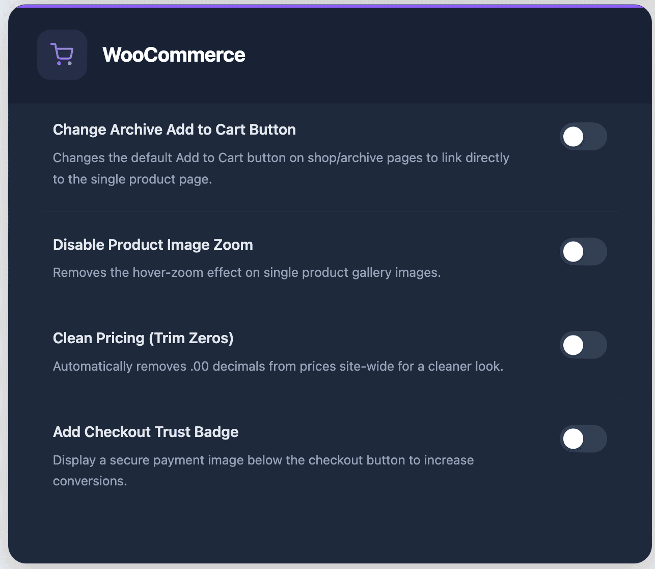
- Remove the WordPress version number — the one in the meta tag and the one in the feed. First thing a scanner greps for.
- Remove WordPress emoji — kills the emoji script and its inline CSS. Small cost, every page, forever.
- Disable XML-RPC — a remote call endpoint most sites do not use and attackers love. One click on, one click off.
- Hide the admin bar for non-admins — editors and shop managers keep what they need, visitors stop seeing the bar.
- Remove the “Created with Elementor” badge — this is the one clients actually notice, which makes it the one I always forget, which is why it is a toggle now.
- Archive Add to Cart → View Product — a WooCommerce behaviour nudge. The button does the thing the client always wanted instead of the thing WooCommerce defaults to.
- Trim the .00 on prices — a small-store fix, and it reads as intentional the moment it is on.
- Disable the Elementor promo banners — the little upsell nag in the editor. Off, and it stays off.
The key idea: every single one of these is reversible by flipping the same toggle back. That is the whole design decision. I could ship the “permanently strip this” version and save myself a line of code, and a client site could have a reason to be broken next week that I would have caused. Instead they are switches. Toggle. Done. Undo. Done.
What I specifically do not do automatically
The one I would not flip without checking first: disable cart fragments. It is a real WooCommerce performance win on a lot of shops, but it will also break a checkout flow that was written to depend on it, and that is a job to verify, not one to assume. It is in the Pro tier of the set, on purpose, because it is the one that changes how the site behaves rather than how it looks.
Everything else above is free and reversible. The Pro tier adds ten more, several of which are WooCommerce-side. If you are not running a shop, ignore that part of the panel entirely.
Frequently asked stuff
Will this slow my site down?
It does the opposite. The whole point of the free set is it removes a bit of weight from your site, not adds. The emoji and version-number ones in particular are a small, direct, measurable win — the script, the meta tag, the badge. Every other toggle is a behaviour change. They do not cost you anything.
Does it need Elementor Pro?
No. Reboot Addons works with free Elementor. And several of these toggles are not even Elementor-specific — the version number, the emoji script, the XML-RPC one. You can run the whole free set on a plain WordPress build with no paid editor.
Can I turn any of these back on?
Every single one is a toggle that flips both ways. You do not “apply” this thing. You flip a switch. That is the design. If a client complains in a quarter, the answer is a flip, not a rebuild.
The list is in the free plugin
It is a free install in the WordPress plugin directory — Reboot Addons, by Reboot Websites. You install it, open Features & Tweaks, and you have your site’s “did I ship that?” list in front of you, every toggle reversible, and the version number gone before the next PageSpeed check. That is the entire job. It is eight switches and a toggle, and it is the reason the “was this finished?” question stops being a client’s.
\n
One more thing. Every toggle in that list is reversible, which means you can try the whole set on a staging copy and keep only what actually moved the number.
I wanted a 3D carousel widget. I did not want to buy Elementor Pro for it.


One more thing. Both carousels are in the free plugin, with real depth, camera controls and no Pro licence. If you need the same look somewhere else, the whole widget set is in the same panel.
See the 3D Carousel widgets