Ignite Your Website with a Fiery Animated Cursor Trail Effect in Elementor | WordPress Tutorial

Wide transparent graphic asset of a torn paper edge rendered in white, appearing blank against a white background
Thumbnail with a man in a dark jacket on the left over a purple glow with the partly hidden heading Management: Where Talent Meets Opportunity behind him, and a large slanted orange side menu panel listing Home, About Us, Services, Our Work, Careers and Contact Us with Facebook, YouTube, Instagram and LinkedIn links, a yellow CLOSE button at the top right, a magenta circle with a white list icon at the lower left, and model portrait cards visible behind the panel

The Creative Overlay Menu in Elementor — A Full-Screen Menu That Shows Off

Reboot Addons' Creative Overlay Menu: a full-screen Elementor menu with kicker, headline, CTA and eleven animated surface options. No custom ...


Read More
A web-design studio desk with a laptop and monitors showing website layouts and design tools — the kind of monthly managed-build behind the R749 to R1999 plans.

R749 vs R999 vs R1999 — What Each Website Package Actually Gets You

R749, R999, R1499 or R1999 a month — what each Reboot Websites package actually builds, and why the gap between ...

Read More
Tall parallax website demo screenshot for Apple Watch Ultra showing a hero with the heading Apple Watch Ultra: Your Companion for Every Adventure over a close up of the watch face on a wrist, a dark section with the heading A REVOLUTIONARY BLEND OF CUTTING-EDGE TECHNOLOGY AND RUGGED DURABILITY FOR THE MODERN EXPLORER beside a floating watch band image, a section of layered watch photos with translucent highlight text, and a flat lay of the watch with an orange band beside a succulent and a Bullet planner notebook, all inside the WordPress admin bar

Advanced Text FX in Elementor — 58 Text Effects in One Widget

Advanced Text FX gives you 58 text-in effects in one Elementor widget — scramble, typewriter, glitch, neon, and a whole ...
Read More
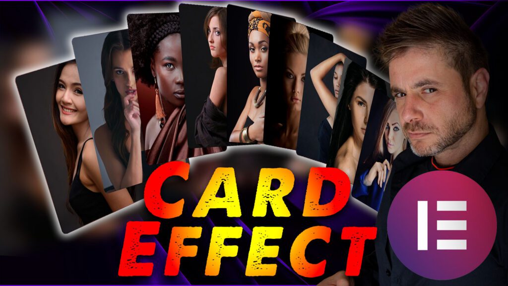
Thumbnail with a man in a dark shirt on the right, a fan of eight portrait cards of women behind him, large distressed red and orange CARD EFFECT lettering across the bottom, a magenta circle with a white list icon at the lower right, and a blurred purple radial background

Elementor Card Widgets without Custom JS — The Free Tier

Seven content widgets plus all six form stylers that build card effects, carousels, and styled forms without writing JS. Widget ...

Read More
Showing Slide 1 of 5
Thumbnail with a man in a dark shirt on the right, a large white arrow mouse cursor with an orange and red comet trail streaming behind it over a blurred website navigation bar listing WordPress Packages, SEO Services, FAQ, Our Story and Blog, with a glowing blue arrow pointing at the trail and a magenta hamburger menu icon

So if you follow along in the video, I refer to this blog post for you to enter code at certain points, so below is everything you will need!

The button below will take you to get the hex codes for the gradient you want to create:

The Following code goes into Elementor -> Custom Code :

				
					  <div class="circle"></div>
  <div class="circle"></div>
  <div class="circle"></div>
  <div class="circle"></div>
  <div class="circle"></div>
  <div class="circle"></div>
  <div class="circle"></div>
  <div class="circle"></div>
  <div class="circle"></div>
  <div class="circle"></div>
  <div class="circle"></div>
  <div class="circle"></div>
  <div class="circle"></div>
  <div class="circle"></div>
  <div class="circle"></div>
  <div class="circle"></div>
  <div class="circle"></div>
  <div class="circle"></div>
  <div class="circle"></div>
  <div class="circle"></div>

<style>
.circle {
  height: 24px;
  width: 24px;
  border-radius: 24px;
  background-color: black;
  position: fixed;
  top: 0;
  left: 0;
  pointer-events: none;
	box-shadow:rgba(0,0,0,0.08) 0px 10px 10px;
  z-index: 9999998; /* so that it stays on top of all other elements */
  transform: translate(35, 35);
  opacity: 0; /* Initially hidden */
  transition: opacity 0.2s ease; /* Smooth fade in/out */
	
}
</style>

<script>
const coords = { x: 0, y: 0 };
const circles = document.querySelectorAll(".circle");

const colors = [
  "#ffeb38", "#ffe332", "#ffda2c", "#ffd126", "#ffc71f", "#ffbd19", 
  "#ffb213", "#ffa70d", "#ff9c07", "#ff9000", "#f98300", "#f37600", 
  "#ed6b00", "#e75f00", "#e15400", "#db4a00", "#d44000", "#ce3600", 
  "#c82d00", "#c22400", "#bc1c00", "#b51400", "#af0d00", "#a90600", 
  "#a30000"
];

circles.forEach(function (circle, index) {
  circle.x = 0;
  circle.y = 0;
  circle.style.backgroundColor = colors[index % colors.length];
});

let idleTimeout;

window.addEventListener("mousemove", function (e) {
  coords.x = e.clientX + 27;
  coords.y = e.clientY + 27;

  // Show circles when mouse moves
  circles.forEach(function (circle) {
    circle.style.opacity = 1; // Fade in
  });

  // Reset idle timeout on mouse move
  clearTimeout(idleTimeout);

  // Start idle timeout to fade out after 1 second
  idleTimeout = setTimeout(function () {
    circles.forEach(function (circle) {
      circle.style.opacity = 0; // Fade out
    });
  }, 100); // 1 second idle time
});

function animateCircles() {
  let x = coords.x;
  let y = coords.y;

  circles.forEach(function (circle, index) {
    circle.style.left = x - 12 + "px";
    circle.style.top = y - 12 + "px";

    circle.style.scale = (circles.length - index) / circles.length;

    circle.x = x;
    circle.y = y;

    const nextCircle = circles[index + 1] || circles[0];
    x += (nextCircle.x - x) * 0.3;
    y += (nextCircle.y - y) * 0.3;
  });

  requestAnimationFrame(animateCircles);
}

animateCircles();

</script>