
So if you follow along in the video, I refer to this blog post for you to enter code at ...
So if you follow along in the video, I refer to this blog post for you to enter code at ...
So if you follow along in the video, I refer to this blog post for you to enter code at ...
So if you follow along in the video, I refer to this blog post for you to enter code at ...
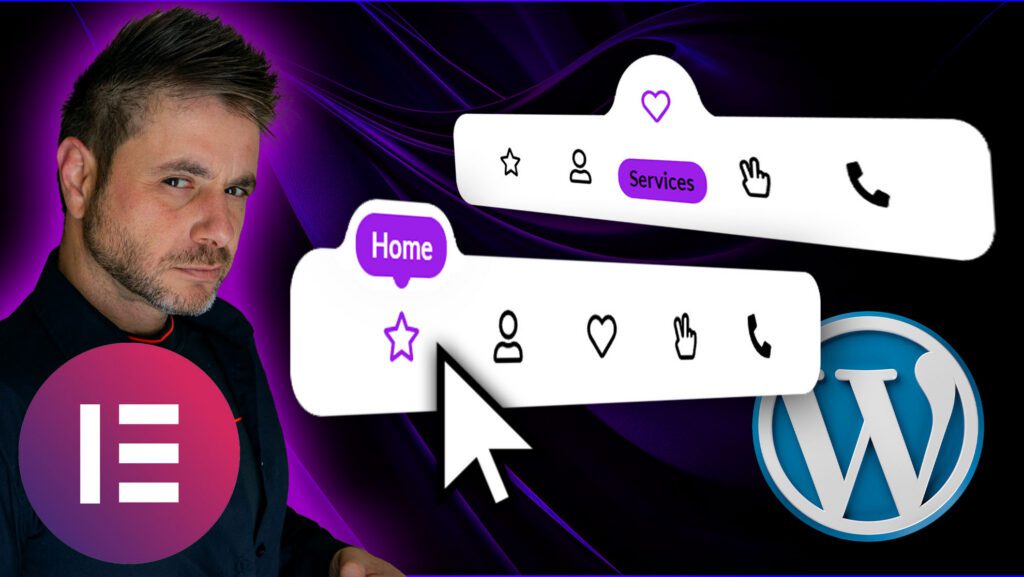
So if you follow along in the video, I refer to this blog post for you to enter code at certain points, so below is everything you will need!
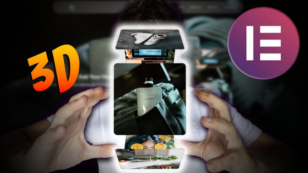
You can download the complete template here
The Following code goes into the Main Container:
					selector{
    --background-color: #FFFFFF;
    --menu-active-color: #9B1FE8;
}
selector{
    width: max-content;
    transform: translateX(-50%);
    transition: none;
    background: var(--background-color);
}
selector:before{
    content: "" !important;
    display: none !important;
}
selector.transition{
    transition: all 0.3s ease-in-out;
}
selector.hidden{
    opacity: 0;
    pointer-events: none;
}
selector .elementor-widget-icon-box.stroke .elementor-icon{
  -webkit-text-fill-color: transparent;
  -webkit-text-stroke-width: 0.08em;
  -webkit-text-stroke-color: currentColor;
}
selector .elementor-widget-icon-box .elementor-icon-box-icon a,
selector .elementor-widget-icon-box .elementor-icon-box-icon span{
    padding-bottom: 9px;
    width: 100%;
    display: flex;
    align-items: center;
    justify-content: center;
    margin: -15px 0 0;
    position: relative;
    z-index: 1;
    transform: translateY(35px);
    transition: none;
}
selector.transition .elementor-widget-icon-box .elementor-icon-box-icon a,
selector.transition .elementor-widget-icon-box .elementor-icon-box-icon span{
    transition: all 0.3s ease-in-out;
}
selector .elementor-widget-icon-box.active .elementor-icon-box-icon a,
selector .elementor-widget-icon-box.active .elementor-icon-box-icon span{
    transform: translateY(0);
}
selector .elementor-widget-icon-box .elementor-icon-box-icon i,
selector .elementor-widget-icon-box .elementor-icon-box-icon svg{
    transition: none;
}
selector.transition .elementor-widget-icon-box .elementor-icon-box-icon i,
selector.transition .elementor-widget-icon-box .elementor-icon-box-icon svg{
    transition: all 0.3s ease-in-out;
}
selector .elementor-widget-icon-box.active .elementor-icon-box-icon i{
    color: var(--menu-active-color);
}
selector .elementor-widget-icon-box.active .elementor-icon-box-icon svg{
    fill: var(--menu-active-color);
}
selector .elementor-icon-box-content{
    width: 125%;
    transform: translate(-50%,8px);
    position: relative;
    left: 50%;
    opacity: 0;
    z-index: -1;
    display: flex;
    align-items: center;
    justify-content: center;
    height: 34px;
    pointer-events: none;
}
selector.transition .elementor-icon-box-content{
    transition: all 0.3s ease-in-out;
}
selector .elementor-widget-icon-box.active .elementor-icon-box-content{
    opacity: 1;
    z-index: 2;
    transform: translate(-50%,0px);
    pointer-events: initial;
}
selector .elementor-icon-box-title a,
selector .elementor-icon-box-title span{
    background: var(--menu-active-color);
    padding: 5px 8px;
    border-radius: 10px;
    display: table;
}
selector a,
selector a:active,
selector a:focus{
    outline: none;
}
selector:not(.v2) .elementor-icon-box-title{
    transform: none !important;
}
selector .elementor-widget-html{
    display: none;
}
@media (max-width: 767px){
selector{
    width: calc(100% + 2px);
    justify-content: center;
}
}


/* Code for version 2 */
selector.v2 .elementor-icon-box-wrapper{
    display: flex;
    flex-direction: column;
}
selector.v2 .elementor-icon-box-content{
    order: -1;
}
selector.v2 .elementor-icon-box-icon a{
    padding: 0;
    margin: 0;
}
selector.v2 .elementor-widget-divider{
    display: none;
}
selector.v2 .elementor-widget-icon-box .elementor-icon-box-icon a,
selector.v2 .elementor-widget-icon-box .elementor-icon-box-icon span{
    padding: 30px 0 5px;
    margin: -44px 0 0;
    transform: translateY(0);
}
selector.v2 .elementor-widget-icon-box.active .elementor-icon-box-content {
    transform: translate(-50%,-20px);
}
selector.v2 .elementor-icon-box-title{
    border: 5px solid var(--background-color);
    border-radius: 17px;
    position: relative;
    box-shadow: 0 -15px 30px 0 rgba(0, 0, 0, 0.1);
}
selector.v2 .elementor-icon-box-title:before,
selector.v2 .elementor-icon-box-title:after{
    content: "";
    position: absolute;
    bottom: 9px;
    width: 13px;
    height: 13px;
    background: transparent;
    border-radius: 50%;
    z-index: -1;
}
selector.v2 .elementor-icon-box-title:before{
    left: -18px;
    box-shadow: 7px 7px var(--background-color);
}
selector.v2 .elementor-icon-box-title:after{
    right: -18px;
    box-shadow: -7px 7px var(--background-color);
}
selector.v2 .elementor-icon-box-content {
    align-items: flex-end;
    width: 200px;
}
selector.v2 .elementor-icon-box-wrapper{
    position: relative;
}
selector.v2 .elementor-icon-box-wrapper:before{
    content: "";
    position: absolute;
    top: 5px;
    width: 8px;
    height: 8px;
    border-radius: 50%;
    z-index: 3;
    left: 50%;
    background: var(--menu-active-color);
    transform: translate(-50%,35px);
    pointer-events: none;
    opacity: 0;
    transition: none;
}
selector.v2 .elementor-widget-icon-box.active .elementor-icon-box-wrapper:before{
    opacity: 1;
    transform: translate(-50%,0);
}
selector.transition.v2 .elementor-icon-box-wrapper:before{
    transition: all 0.3s ease-in-out;
}
selector.v2 .elementor-icon-box-icon{
    position: relative;
}
selector.v2 .elementor-icon-box-icon:before,
selector.v2 .elementor-icon-box-icon:after{
    content: "";
    position: absolute;
    top: -27px;
    width: 5px;
    height: 5px;
    border-radius: 50%;
    z-index: 3;
    background: transparent;
    transform: translate(-50%,35px);
    pointer-events: none;
    opacity: 0;
    transition: none;
}
selector.v2 .elementor-icon-box-icon:before{
    box-shadow: 2px -2px var(--menu-active-color);
    left: calc(50% - 7px);
}
selector.v2 .elementor-icon-box-icon:after{
    box-shadow: -2px -2px var(--menu-active-color);
    left: calc(50% + 7px);
}

selector.v2 .elementor-widget-icon-box.active .elementor-icon-box-icon:before,
selector.v2 .elementor-widget-icon-box.active .elementor-icon-box-icon:after{
    opacity: 1;
    transform: translate(-50%,0);
}
selector.transition.v2 .elementor-icon-box-icon:before,
selector.transition.v2 .elementor-icon-box-icon:after{
    transition: all 0.3s ease-in-out;
}

@media (max-width: 767px){
selector.v2{
    border-radius: 0;
    padding-left: 10px;
    padding-right: 10px;
}
}


/* Code for version 3 */
selector.v3{
    --default-text-color: #000;
    --active-icon-color: #fff!important;
}
selector.v3{
    padding-bottom: 3px;
}
selector.v3 .elementor-icon-box-content{
    opacity: 1;
    z-index: 1;
}
selector.v3 .elementor-icon-box-title a,
selector.v3 .elementor-icon-box-title span{
    background: none;
    color: var(--default-text-color);
}
selector.v3 .elementor-widget-icon-box.active .elementor-icon-box-title a,
selector.v3 .elementor-widget-icon-box.active .elementor-icon-box-title span{
    color: var(--menu-active-color);
}
selector.v3 .elementor-widget-icon-box .elementor-icon-box-icon a,
selector.v3 .elementor-widget-icon-box .elementor-icon-box-icon span{
    padding-bottom: 32px;
    margin-top: -19px;
}
selector.v3 .elementor-widget-icon-box.active .elementor-icon-box-icon a,
selector.v3 .elementor-widget-icon-box.active .elementor-icon-box-icon span{
    transform: translateY(16px);
}
selector.v3 .elementor-icon-box-content{
    transform: translate(-50%,0px);
}
selector.v3 .elementor-widget-icon-box.active .elementor-icon-box-content{
    transform: translate(-50%,-3px);
}
selector.v3 .elementor-widget-divider .elementor-widget-container:before{
    content: '';
    position: absolute;
    background: var(--menu-active-color);
    border-radius: 100%;
    top: 5px;
    left: 5px;
    height: calc(100% - 5px*2);
    width: calc(100% - 5px*2);
}
selector.v3 .elementor-widget-divider{
    top: -24px;
}
selector.v3 .elementor-widget-divider:before {
    top: -6px;
    left: -24px;
}
selector.v3 .elementor-widget-divider:after{
    z-index: -1!important;
    top: -6px;
    right: -24px;
}
selector.v3 .elementor-widget-icon-box.active .elementor-icon-box-icon i{
    color: var(--active-icon-color);
}
@media (max-width: 767px){
selector.v3{
    padding-left: 10px;
    padding-right: 10px;
}
}
The Following code goes into the divider widget in the custom css section:
					.icon-menu .elementor-widget-divider{
    transition: none;
}
.icon-menu.transition .elementor-widget-divider{
    transition: margin-top 0.3s ease-in-out, opacity 0.1s ease-in-out;
}
.icon-menu .elementor-widget-divider{
    opacity: 0;
    margin-top: 20px;
}
.icon-menu.bubbling .elementor-widget-divider{
    opacity: 1;
    margin-top: 0px;
}
.icon-menu.bubble .elementor-widget-divider{
    transition: all 0.3s ease-in-out, opacity 0.1s ease-in-out;
}
selector .elementor-widget-container{
    background: var(--background-color);
}
selector:before{
    content: "";
    position: absolute;
    top: 4px;
    left: -29px;
    width: 30px;
    height: 30px;
    background: transparent;
    border-radius: 50%;
    box-shadow: 15px 18px var(--background-color);
}
selector:after{
    content: "";
    position: absolute;
    top: 4px;
    right: -29px;
    width: 30px;
    height: 30px;
    background: transparent;
    border-radius: 50%;
    box-shadow: -15px 18px var(--background-color);
}
selector{
    z-index: -1!important;
}
The Following code goes into the HTML widget:
					<script src="https://code.jquery.com/jquery-3.6.0.min.js"></script>
<script>

var $ = jQuery,
    clickLock = false,
    currentIndexes = [],
    movingAnimations = [],
    bottomOffset = 200,
    hash = true


// Align the circle to the center of the icon

function getCenter(el){
    return el.position().left + el.width()/2
}


// Move the circle

function moveCircle(parent, el){
    var centerDiff = getCenter(el) - getCenter(parent.find('.elementor-widget-icon-box').eq(0))
        leftOffset = parent.find('.elementor-widget-icon-box').eq(0).offset().left - parent.offset().left

    parent.find('.elementor-widget-divider').css('transform', 'translateX(' + (centerDiff+leftOffset) + 'px)')
}


// Make the icon highlighted

function setActive(menu, index, i){
    menu.addClass('bubbling')
    movingAnimations[i] = true
    setTimeout(function(){
        if(movingAnimations[i]){ menu.addClass('bubble') }
    },50)
    menu.find('.elementor-widget-icon-box').removeClass('active')
    menu.find('.elementor-widget-icon-box').eq(index).addClass('active')
    moveCircle(menu, menu.find('.elementor-widget-icon-box').eq(index))
}


// Remove highlighted if needed

function removeActive(menu, i){
    movingAnimations[i] = false
    menu.removeClass('bubbling bubble')
    menu.find('.elementor-widget-icon-box').removeClass('active')
}

$(document).ready(function(){

$('.icon-menu').each(function(i){

var $this = $(this)

currentIndexes.push(-1)
movingAnimations.push(false)

// Hover Effect

$this.find('.elementor-widget-icon-box').on('mousemove mouseenter', function(){
    setActive($this, $(this).index(), i)
})


// Back to current item on mouse leave

$this.on('mouseleave', function(){
    if(currentIndexes[i] == -1){
        removeActive($this, i)
    }else{
        setActive($this, currentIndexes[i])
    }
})


// Click Effect

$this.find('.elementor-widget-icon-box').on('click', function(e){

    if( !hash ){
        var link = $(this).find('a').attr('href')
        if( link == '' || link[0] == '#' ){ return }
    }

    setActive($this, $(this).index(), i)
    currentIndexes[i] = $(this).index()
    clickLock = true
    setTimeout(function(){
        clickLock = false
    },1500)
})

})
})

function removeSlash(str){
    return str.replace(/^\/+|\/+$/g, '')
}

function getPath(url){
    return removeSlash((new URL(url, location.protocol+'//'+location.hostname)).pathname)
}

$(window).on('load', function(){

$('.icon-menu').each(function(i){

var $this = $(this)

$this.find('.elementor-widget-icon-box').each(function(index){


    // Add # in case of empty link

    var span1 = $(this).find('span.elementor-icon'),
    span2 = $(this).find('.elementor-icon-box-title span')


    if( span1.length ){
        span1.replaceWith($('<a class="elementor-icon elementor-animation-" href="#">' + span1.html() + '</a>'))
    }
    if( span2.length ){
        span2.replaceWith($('<a href="#">' + span2.html() + '</a>'))
    }


    // Hightlight icon in case of page URL

    var link = $(this).find('a').eq(0).attr('href')
    if(link){
        if(link[0] != '#'){
            hash = false
            if(getPath(link) == removeSlash(location.pathname)){
                setActive($this, index, i)
                currentIndexes[i] = index
            }
        }
    }
})


// Avoid initial animation

setTimeout(function(){
    $this.addClass('transition')
},400)

})
})


// Title overflow fixing for v2

$(window).on('load resize', function(){

$('.icon-menu').each(function(i){

var $this = $(this)

$this.find('.elementor-widget-icon-box').each(function(index){

    if($this.hasClass('v2')){

        var offset = 20,
        title = $(this).find('.elementor-icon-box-title'),
        titleLeft = title.offset().left,
        menuLeft = $this.offset().left,
        titleRight = titleLeft + title.outerWidth(),
        menuRight = menuLeft + $this.outerWidth(),
        translateLeft = titleLeft - menuLeft,
        translateRight = menuRight - titleRight

        if($(window).width() < 768){
            offset = 4
        }

        // Right fix

        if(translateRight < offset){
            title.css('transform', 'translateX(' + (translateRight-offset) + 'px)')
        }

        // Left fix

        if(translateLeft < offset){
            title.css('transform', 'translateX(' + (offset - translateLeft) + 'px)')
        }
    }
})

})
})

var delay = 100

$(window).on('load scroll resize', function(e){

setTimeout(function(){

var topIds = [],
    selector = $('[data-elementor-type="wp-page"] > *:not(.icon-menu)')

selector.each(function(){
    if($(window).scrollTop() + $(window).height() - 350 > $(this).offset().top){
        topIds.push($(this).attr('id'))
    }
})

topIds = topIds.filter(element => element !== undefined)

$('.icon-menu').each(function(i){

    var $this = $(this),
        menuIndex

    // Hide menu near window bottom

    if( $('body').height() > $(window).height()+bottomOffset+100 ){
        if($('body').height() < $(window).scrollTop()+$(window).height()+bottomOffset){
            $this.addClass('hidden')
        }else{
            $this.removeClass('hidden')
        }
    }


    // Auto hightlight icon on scroll, load and resize

    if( !hash || clickLock ) {
        if( currentIndexes[i] != -1 && e.type == 'resize'){
            moveCircle($this, $this.find('.elementor-widget-icon-box').eq(currentIndexes[i]))
        }
        return
    }

    topIds.forEach(function(id, index){
        if( menuIndex!=undefined && menuIndex > -1 ) return
        var menuId = topIds[topIds.length - 1 - index]
        menuIndex = $this.find('[href="#'+ menuId +'"]').closest('.elementor-widget-icon-box').index()
        currentIndexes[i] = menuIndex
    })

    if( menuIndex==undefined || menuIndex == -1 ){
        currentIndexes[i] = -1
        removeActive($(this), i)
    }else{
        setActive($(this), menuIndex, i)
    }

})
delay = 0
},delay)
})

</script>