So if you follow along in the video, I refer to this blog post for you to enter code at ...
So if you follow along in the video, I refer to this blog post for you to enter code at ...
So if you follow along in the video, I refer to this blog post for you to enter code at ...
So if you follow along in the video, I refer to this blog post for you to enter code at ...

So if you follow along in the video, I refer to this blog post for you to enter code at certain points, so below is everything you will need!
You can download the complete template here
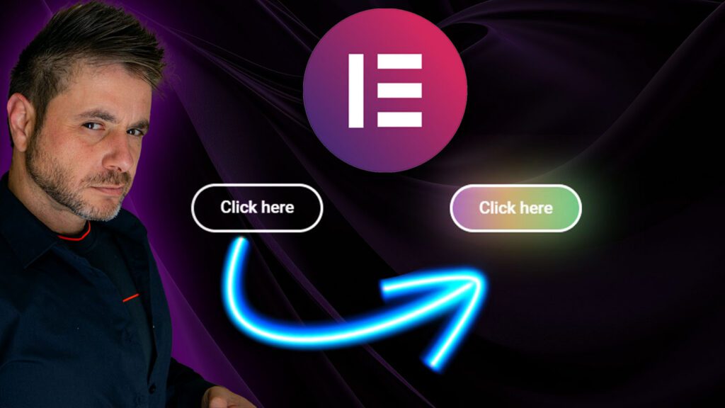
The Following code goes into the button widget (Animated background glow effect):
					/* First, define the --rotate property as animatable */
@property --rotate {
  syntax: "<angle>";
  initial-value: 0deg;
  inherits: false;
}

selector {
  --first-color: #B96DED;
  --second-color: #EDBE6D;
  --third-color: #6DEDA3;
  --size-of-blur: 20px;
  --spin-speed: 2.5s;
  --spread-scale: 1.1;
  --pulse-opacity: 0.6;
  --glow-border-radius: 40px;

  position: relative; /* Ensure proper positioning context */
  z-index: 1; /* Set a higher z-index for the button */
}

selector::before,
selector::after {
  content: "";
  position: absolute;
  z-index: 0;
  top: 0;
  left: 0;
  width: 100%;
  z-index: -1;
  height: 100%;
  border-radius: var(--glow-border-radius); /* Inherit border radius from the button */
  background-image: linear-gradient(
    var(--rotate),
    var(--first-color),
    var(--second-color) 43%,
    var(--third-color)
  );
  opacity: 0;
  pointer-events: none; /* Ensure it doesn't interfere with interactions */
  animation: pulse var(--spin-speed) ease-in-out infinite;
}

selector::after {
  filter: blur(var(--size-of-blur));
  transform: scale(var(--spread-scale));
}

@keyframes pulse {
  0% {
    --rotate: 0deg;
    opacity: var(--pulse-opacity);
  }
  50% {
    --rotate: 180deg;
    opacity: 1;
  }
  100% {
    --rotate: 360deg;
    opacity: var(--pulse-opacity);
  }
}
The Following code goes into the button widget (Complete Animated glow effect):
					/* First, define the --rotate property as animatable */
@property --rotate {
  syntax: "<angle>";
  initial-value: 0deg;
  inherits: false;
}

selector {
  --first-color: #B96DED;
  --second-color: #EDBE6D;
  --third-color: white;
  --size-of-blur: 20px;
  --spin-speed: 2.5s;
  --spread-scale: 1.1;
  --pulse-opacity: 0.6;
  --glow-border-radius: 50px;

  position: relative; /* Ensure proper positioning context */
  z-index: 1; /* Set a higher z-index for the button */
}

selector:hover::before,
selector:hover::after {
  content: "";
  position: absolute;
  z-index: 0;
  top: 0;
  left: 0;
  width: 100%;
  z-index: -1;
  height: 100%;
  border-radius: var(--glow-border-radius); /* Inherit border radius from the button */
  background-image: linear-gradient(
    var(--rotate),
    var(--first-color),
    var(--second-color) 43%,
    var(--third-color)
  );
  opacity: 0;
  pointer-events: none; /* Ensure it doesn't interfere with interactions */
  animation: pulse var(--spin-speed) ease-in-out infinite;
}

selector::after {
  filter: blur(var(--size-of-blur));
  transform: scale(var(--spread-scale));
}

@keyframes pulse {
  0% {
    --rotate: 0deg;
    opacity: var(--pulse-opacity);
  }
  50% {
    --rotate: 180deg;
    opacity: 1;
  }
  100% {
    --rotate: 360deg;
    opacity: var(--pulse-opacity);
  }
}